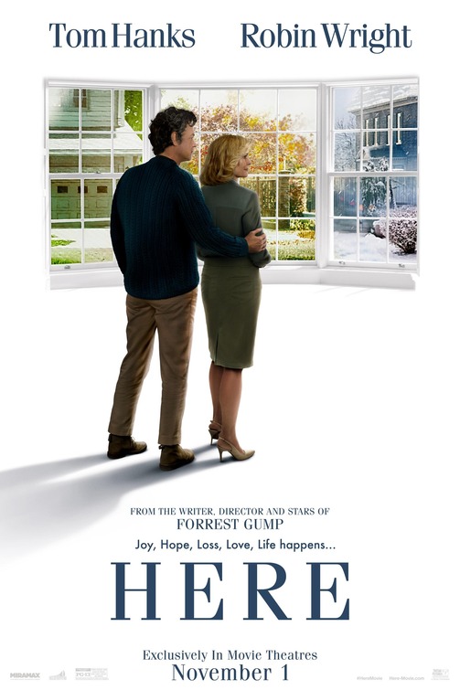
I’ve heard it and thought it several times now: Hollywood plays it too safe. The cost of making movies is so (almost certainly unnecessarily) high now that convention reigns and original or daring works are simply too risky. Unless a filmmaker has enough of a reputation that hearing their name alone will attract audiences, assuming that even holds true anymore (just ask Clint Eastwood), it’s unlikely we’ll see anything new. However, there are occasionally exceptions. If there’s a name that conjures up both beloved films and formal innovation, it’s Robert Zemeckis. While he’s certainly experimented with his last few movies through performance capture animation, his recent work has left a lot to be desired. His latest, Here, promises to be a return to form. Based on Richard McGuire’s acclaimed graphic novel of the same name, itself expanded from a groundbreaking 1989 comic in Raw, it aims to challenge cinematic convention while applying cutting-edge visual effects and telling a story that’s intimate while encompassing the enormity of time and the universal human experience. This is the sort of movie that tries to be unlike anything else, and it was one I was hotly anticipating. Having now seen it, I can tell you that they mostly failed and I’m extremely disappointed.
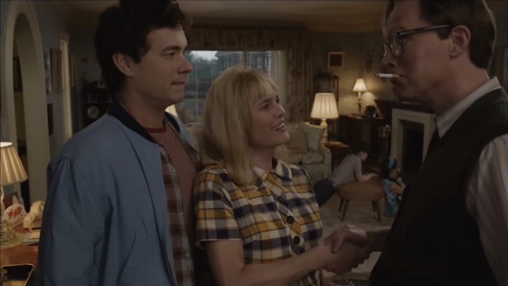
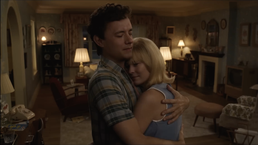
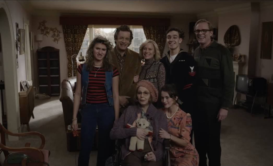
The story of Here is about a place and the people that inhabit it. The camera stays still but the scenery changes, starting during the age of the dinosaurs, and moving ahead to Native American peoples, colonial times, the 1800s, the entire 20th century, and the early 21st century to the present. A house is built, and a number of key players arrive to inhabit it. There’s an early airplane pilot and his wife and daughter. Then they’re replaced by an inventor and his wife, the former of whom may have stumbled on the perfect invention at the perfect time. However, once they leave, the primary focus of the story begins, as Al (Paul Bettany) and his wife Rose buy the house after World War II and start a family. Later, one of their sons, Richard (Tom Hanks), meets Margaret (Robin Wright), who becomes his girlfriend. He later marries and has a daughter with her, Vanessa. From there, much of the film follows the trials and tribulations of the family throughout the ensuing decades, all against the backdrop of what occurred before them and what will happen after.
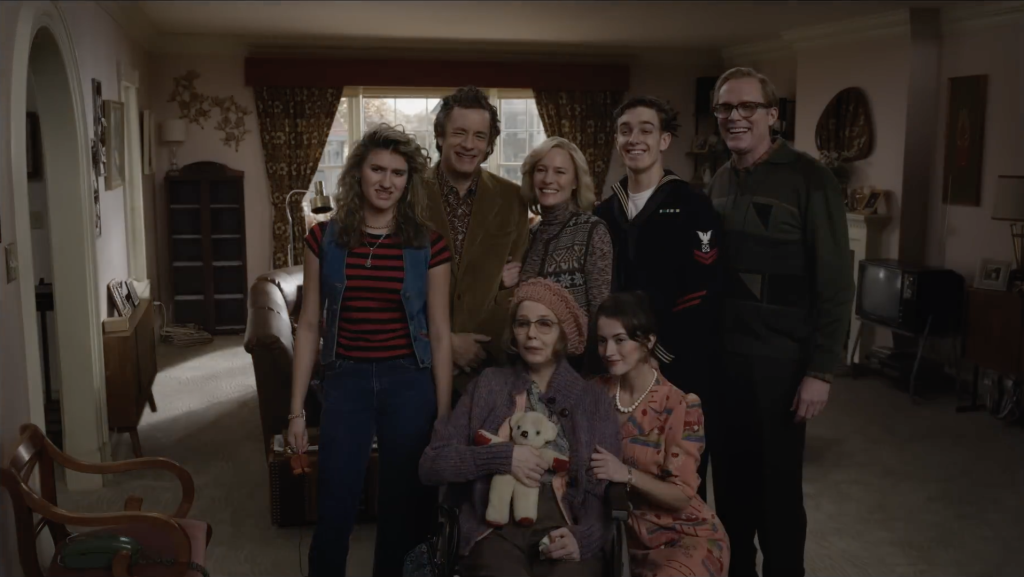
First of all, this gimmick isn’t new, and didn’t take long to wear off. Hell, I’d argue that Adult Swim did this better two years ago with their Yule Log special, and that was just because they could. However, I do applaud the effort in translating the comic’s art style to the screen. Essentially, rather than cutting between time periods, windows will show the location as it was in the past or future, much like the original source material, before fading in to the whole frame. This often creates some fun editing opportunities, but many other times it doesn’t work as well as I wanted it to. (Also there’s some really off-putting transitions that appear to be automated.) In addition, the narrative doesn’t live up to the editing flourishes. The story is non-linear, but often jumps around at random, even if to set up a point, and it initially made it hard for me to get invested in the characters as a result. Also, the single perspective occasionally leads to awkward cinematography. Characters will sometimes speak their lines directly into the camera or stand too close to it. It’s like watching a play except instead of seeing it on a theater stage, you’re just standing in a house and the actors are ignoring you as they’re performing.
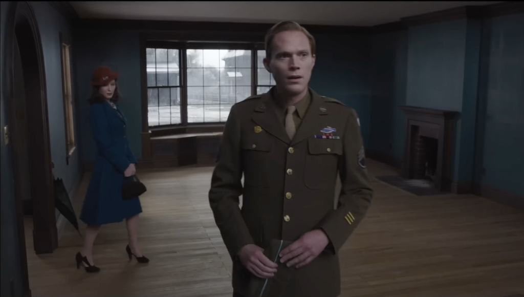
Once the main story became apparent, I was at the very least engaged. I can’t hate Tom Hanks and Robin Wright in this. Because of the length of time required for the premise, Zemeckis uses real-time de-aging technology to make the two of them look younger, and for the most part, I thought it worked. Yet while I may be a sucker for sentimentality, there’s some decisions in this that feel a bit too on the nose, and at the end of the day, it’s a pretty standard slice-of-life story. While I found it enjoyable in the moment, it was only afterwards when I started thinking about the film that the flaws became clear. Since the story jumps around so much, it’s sometimes difficult to keep track of the timeline. There are clues in the background that let you know the historical vicinity of the events, but other times I was unsure if the main story was even in order. There is a bit of a central conflict, but, without spoiling things too much, portions of the movie even early on flash forward to when the conflict is clearly resolved. On top of that, most of the other characters in this movie aside from the main story are more or less irrelevant outside of the primary theme and gimmick, so there’s not much reason to care about them from a narrative perspective. Despite this, they get a lot of screen time.
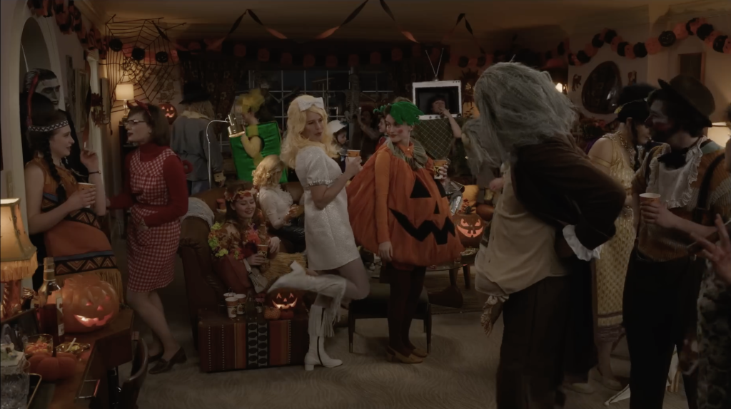
While the ending certainly drives the point home and warms one’s heart, it also makes it obvious why I found this movie so disappointing: what is the point of it? Okay, that’s a bit harsh. It’s a slice of life drama about a single location through the enormity of time, mainly focusing on a single family across decades and highlighting major changes, historical recurrences, and human truths. That’s fine. Yet, I don’t think that’s what Zemeckis was going for. As a filmmaker, he’s known for trying to reinvent the wheel visually, having done so with films such as Who Framed Roger Rabbit and Forrest Gump, and it’s obvious why he would be attracted to source material like this. The original comic was experimental with its use of panel art, and he clearly wanted to create something unlike anything anyone has done before. Here’s the problem though: People have done things like this before for thousands of years. It’s called theater. All he did was play around with the editing. As for the real-time de-aging technology, that’s certainly innovative, but it’s not going to carry a film. If you think about it, the story can basically be described as a family living in a house, after other people who lived after other people, before other people still, and in a location that changed massively over thousands of years. That’s certainly a premise with a lot of opportunity for interesting and mind-blowing storytelling, but Zemeckis didn’t seem to do that. However, a comic is different. It doesn’t move. It’s individual pictures that we can stare at for as long as we want, but we expect them to be sequential. Richard McGuire’s Here was actually innovative. It challenges the way we think about comic storytelling, in a way that only comics could do. It just doesn’t translate well enough as a movie.
In the end, Here is a perfectly normal story that really wants to be groundbreaking, as did I, but it simply isn’t. Comic book movies may be all the rage (for now), but some stories should just stay as still art. Incidentally, in the process of writing this review, I discovered a faithful 1991 student film adaptation of the original comic. You can watch it here. It does more in six minutes than Robert Zemeckis did in 104, is actually formally experimental, and drives the point home in the amount of time it takes for the gimmick to wear off.

Leave A Reply